
iOS 26 Liquid Glass Design Makes App Icons Look Crooked, Report Users
iOS 26's Liquid Glass: A Stunning Illusion or a Design Flaw?
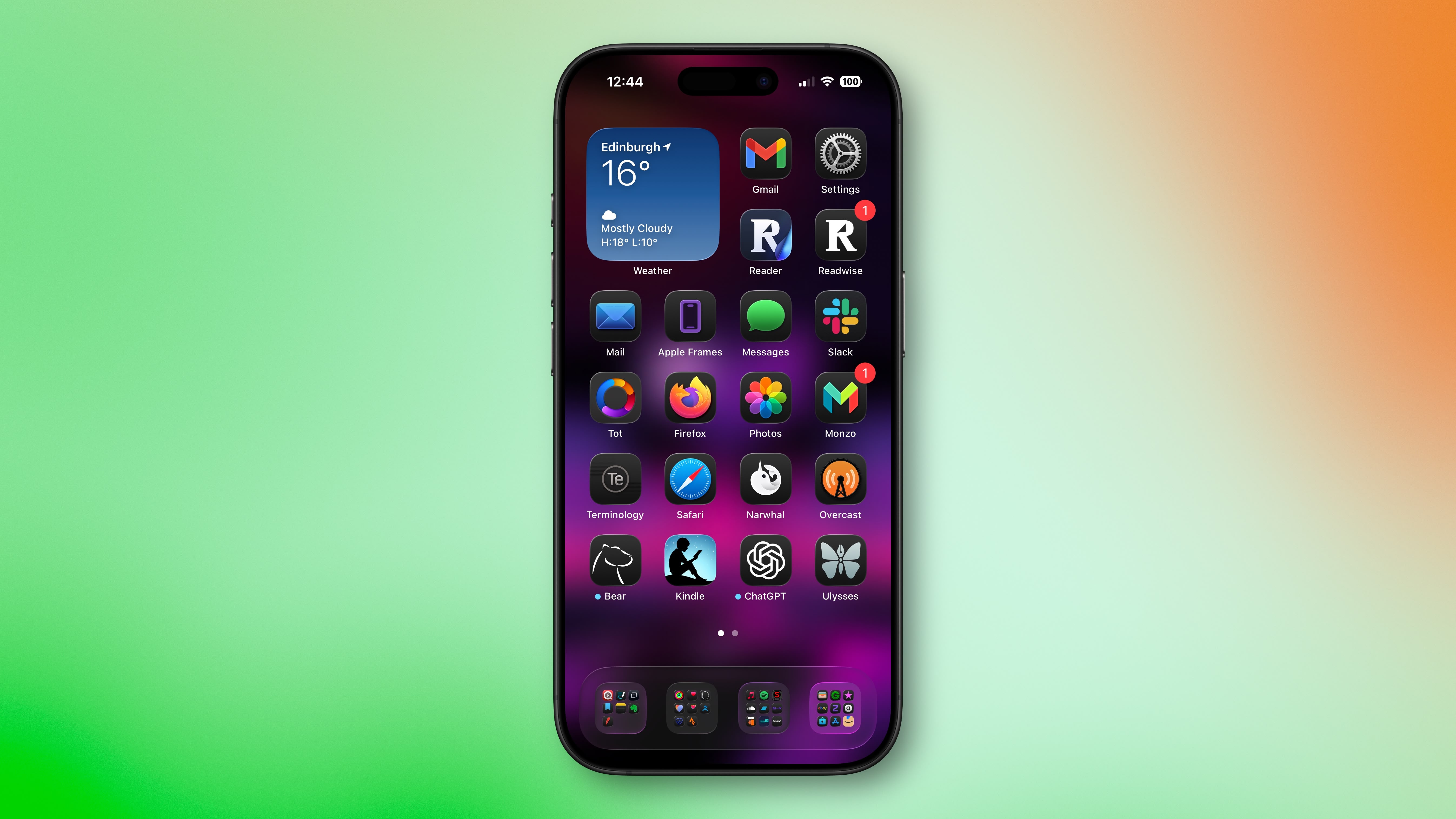
Apple's iOS 26 introduced a visually striking new interface element called "Liquid Glass." This feature adds subtle glowing effects to the corners of app icons, creating a dynamic, glass-like appearance with depth and parallax effects. While intended to enhance the aesthetic appeal of the operating system, this design choice has unexpectedly caused a significant visual problem for some users: app icons appear tilted or slanted.
The Tilting Icon Illusion
As reported by various sources, including Gizmodo, the Liquid Glass effect creates an optical illusion that distorts the perception of app icon placement. Instead of appearing straight, icons seem to lean or tilt, causing a disorienting effect for some users. This isn't a minor visual glitch; many users report feeling genuinely disoriented, with some even experiencing dizziness from the perceived slanting.
The issue isn't limited to a small number of users. A Reddit thread discussing this problem garnered over 3,000 upvotes, highlighting the widespread nature of the concern. User comments paint a picture of significant frustration and discomfort. Phrases like "really distracting," "feel drunk," and even "optical nightmare" underscore the severity of the issue for affected individuals.
When is the Effect Most Noticeable?
The tilting effect is particularly pronounced under specific conditions. Users have reported that the illusion is most noticeable when using dark or black backgrounds in conjunction with "Dark," "Clear," or "Tinted" icon modes. The contrast between the dark background and the glowing, refractive corners of the icons seems to amplify the perceived slant. Interestingly, colorful wallpapers appear to mitigate the effect, likely by diverting attention away from the problematic corner highlights.
Attempts to Mitigate the Problem
Many affected users have attempted to counteract the issue using Apple's built-in accessibility settings. Apple offers options to reduce transparency and the widely-used "Reduce Motion" setting (found in Settings ➝ Accessibility ➝ Motion ➝ Reduce Motion). Unfortunately, reports suggest that these settings have little to no effect on the tilting icon illusion, leaving many users frustrated and without a solution.
A Call for a Dedicated Control
The lack of an effective solution within existing settings points to a critical oversight in the design of the Liquid Glass feature. While the visual appeal is undeniable for some, the disorienting and potentially debilitating effects on a significant portion of users highlight a need for greater user control. Many are calling for Apple to add a dedicated setting in a future iOS update that allows users to adjust or entirely disable the icon glow effect responsible for the tilting illusion.
Conclusion: Balancing Aesthetics and Accessibility
iOS 26's Liquid Glass interface, while aesthetically pleasing to some, has presented a significant accessibility problem for a substantial number of users. The unexpected tilting effect on app icons, resulting in disorientation and even dizziness, demonstrates a critical need for Apple to prioritize user experience and accessibility alongside visual appeal. The current lack of effective mitigation options within the operating system's settings emphasizes the urgent need for a dedicated control to adjust or disable the problematic icon glow effect. Until such a solution is implemented, many users will continue to experience the frustrating and potentially debilitating effects of this unintended optical illusion.
Have you experienced this issue with the iOS 26 Liquid Glass interface? Share your experiences in the comments below.
Further Reading and Discussion
This article, "iOS 26 Liquid Glass Design Makes App Icons Look Crooked, Report Users" originally appeared on MacRumors.com.
Join the discussion in our forums: Discuss this article
from MacRumors
-via DynaSage
