iOS 26: Make App Icons Clear on Your iPhone Home Screen
iOS 26's Stunning New Clear App Icon Style: A Complete Guide
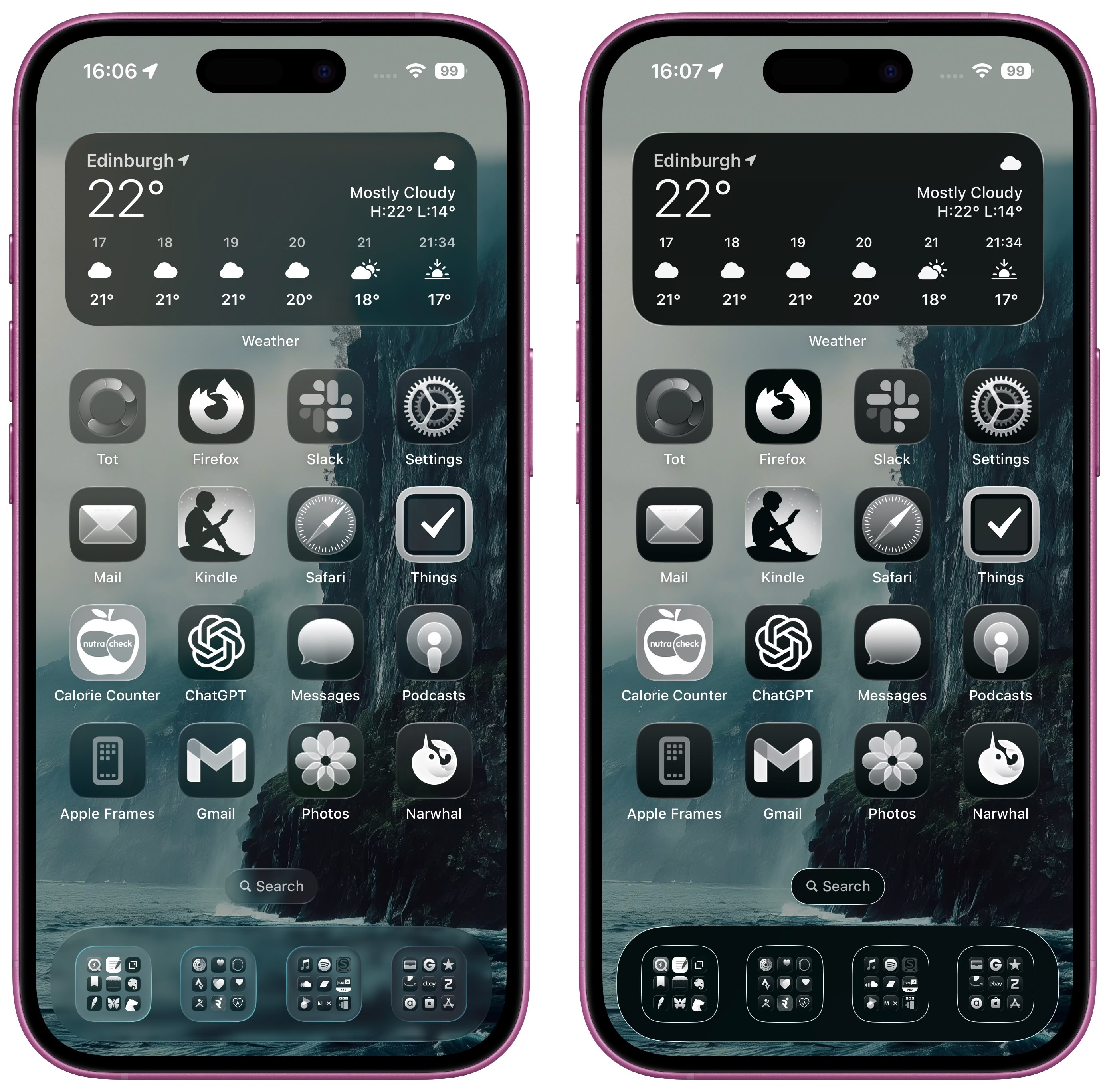
iOS 26 brings a significant visual refresh with its new "Liquid Glass" design. This overhaul introduces translucent elements throughout the system, creating a more modern and visually appealing interface. One of the most noticeable changes is the option for "Clear" app icons, giving your Home Screen a completely new look.
The Liquid Glass design affects various elements on your iPhone's Home Screen, including the search bar, dock, and app folders, all of which now feature a translucent appearance. But the star of the show is undoubtedly the new "Clear" app icon style. This option transforms your app icons into semi-transparent, glass-like panels, revealing a subtle glimpse of your wallpaper beneath. The effect extends to widgets as well, creating a cohesive, modern aesthetic.
This isn't just a simple transparency effect. The Clear style adds a layer of depth and dimension to your icons and widgets, making them look like reflective glass panes. The layered effect preserves the app's iconography, but with a much sleeker and more modern look. It’s a significant departure from the previous flat and tinted icon styles introduced in earlier iOS versions.
Apple offers three options for the Clear style:
- Light Mode: In Light Mode, app icons appear semi-transparent, subtly darkening the wallpaper beneath for a balanced appearance.
- Dark Mode: In Dark Mode, icons maintain some transparency, but are slightly darkened to provide better contrast against the dark background, while preserving the layered effect.
- Auto: This option intelligently switches between Light and Dark modes depending on your iPhone's current Appearance setting, offering seamless integration with your preferred theme.
How to Enable Clear App Icons in iOS 26
Enabling the Clear app icon style is surprisingly straightforward:
- Enter Jiggle Mode: On your iPhone's Home Screen, firmly press and hold an empty space until the icons begin to jiggle. This indicates you've entered "jiggle mode" (also known as editing mode).
- Access Customization Menu: Tap "Edit" in the top-left corner of the screen. A pop-up menu will appear. Tap "Customize".
- Select Clear Style: A panel will appear at the bottom of the screen. Select "Clear" to activate the new icon style.
- Choose Your Mode: Now choose between "Light," "Dark," or "Auto" mode depending on your preference. If you find that the icons or app labels are difficult to see in a particular mode, tap the sun icon in the top-left corner of the Customize panel to adjust the wallpaper's brightness and enhance readability.
Addressing Accessibility Concerns
While the Clear app icon style is visually stunning, some users might find the transparency reduces readability. Fortunately, iOS 26 provides accessibility settings to address this concern. If you're experiencing difficulty reading app labels or icons, navigate to:
Settings > Accessibility > Display & Text Size
Here, you'll find two useful toggles:
- Reduce Transparency: This setting lessens the transparency of the icons, improving contrast and making the app labels easier to read.
- Increase Contrast: This setting enhances the overall contrast on your screen, further improving the readability of the Clear app icons.
Note that enabling both "Reduce Transparency" and "Increase Contrast" will significantly reduce the translucency of the icons, almost eliminating the glass-like effect. Experiment with these settings to find the optimal balance between aesthetics and readability.

Liquid Glass Across Apple's Ecosystem
The Liquid Glass design isn't limited to iOS 26. It's also a prominent feature in iPadOS 26, macOS 26, watchOS 26, and tvOS 26, creating a consistent visual experience across Apple's entire ecosystem. iPadOS 26 largely mirrors the iOS 26 experience. macOS 26 features translucent menu bars, dock backgrounds, buttons, sidebars, navigation bars, and Control Center, integrating the Liquid Glass aesthetic beautifully into the desktop environment.
The Clear app icon style, along with the overall Liquid Glass design, presents a significant visual upgrade for iOS and the broader Apple ecosystem. It offers a modern, sleek aesthetic while providing customization options to cater to individual preferences and accessibility needs.
This article, "iOS 26: Make App Icons Clear on Your iPhone Home Screen" first appeared on MacRumors.com
Discuss this article in our forums
from MacRumors
-via DynaSage

