
Apple's New Alarm Design in iOS 26 Might Make You Oversleep
iOS 26's Redesigned Alarm: A Surprisingly Controversial Update
Apple's iOS 26 beta introduces a revamped alarm screen in the Clock app. The new design boasts a cleaner aesthetic, featuring a larger clock display and significantly bigger buttons for "Stop" and "Snooze." These buttons are now equally sized and positioned side-by-side at the bottom of the screen. This seemingly simple change, however, has sparked debate amongst users and developers alike.
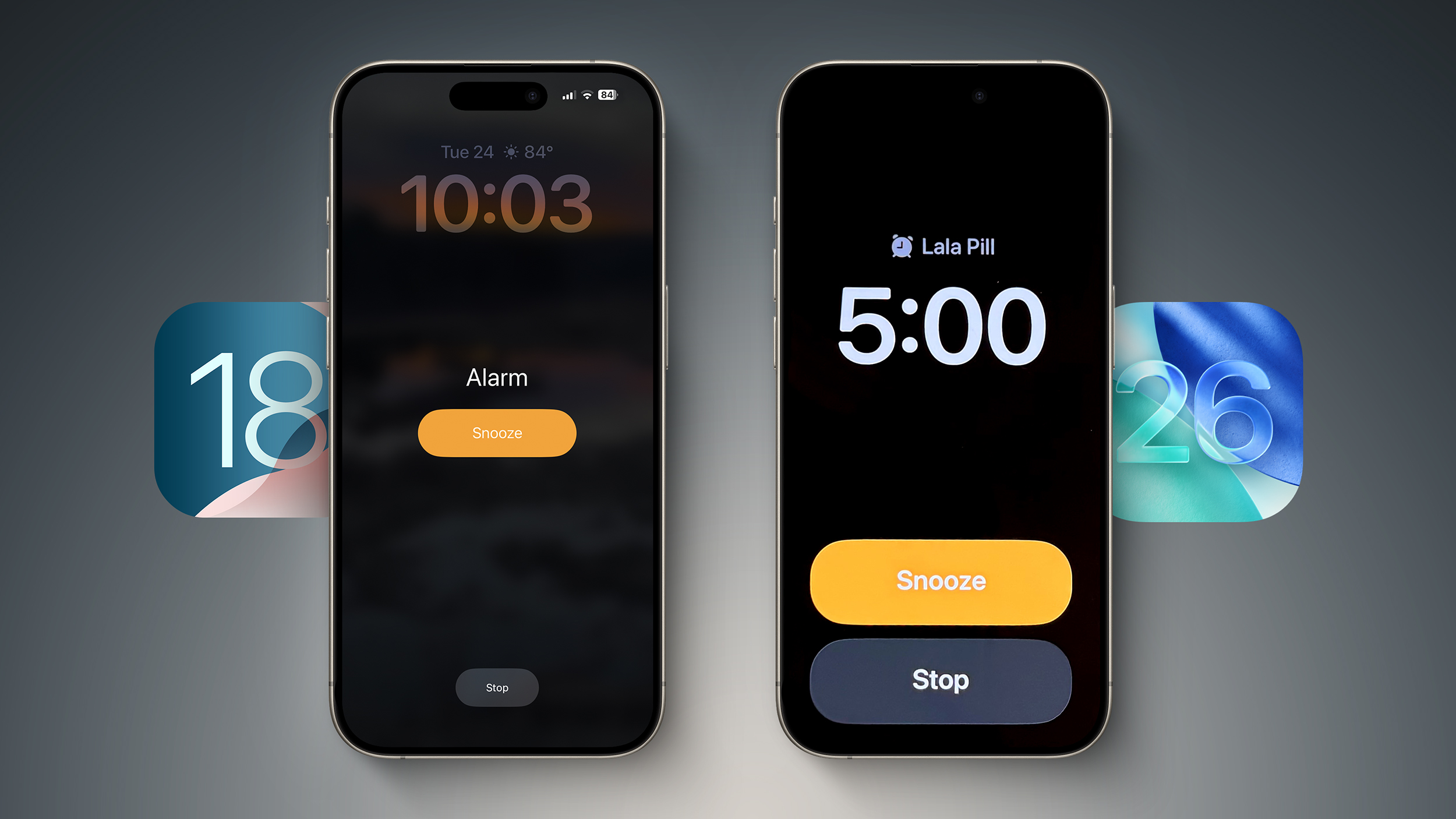
Alarm screen in iOS 18 (left) versus iOS 26 beta 2
A Design Choice that Contradicts Past Research
While the redesign aligns with Apple's overall visual refresh in iOS 26, it appears to contradict previously established principles of user interface (UI) design, specifically regarding alarm dismissal. Past iterations of iOS employed a design where the "Snooze" button was prominently displayed and significantly larger than the "Stop" button. This design choice was deliberate, aiming to minimize accidental dismissals while still half-asleep.
Jack Fields, a former Apple engineer and currently a writer at Kernel Extension, sheds light on this apparent contradiction. He was involved in internal testing at Apple that explored the optimal design for alarm buttons.
The testing involved a specialized version of the Clock app that created a heatmap of user interactions. This heatmap tracked precisely where users touched the screen when attempting to dismiss their alarms while still drowsy. The results were revealing, and perhaps counterintuitive.
"It was recording where our sleepy hands were smacking around on the screen in order to see how accurate we were in turning off the alarms," says Fields. The data showed that when the "Stop" and "Snooze" buttons were of equal size and proximity, users were 30% more likely to accidentally hit "Stop," thereby increasing the chances of oversleeping.
The Importance of Button Size and Placement
This finding underscores the importance of button size and placement in UI design, particularly in situations where the user is not fully alert. The previous iOS designs, with a larger, prominent "Snooze" button and a smaller, less conspicuous "Stop" button, were based on this research. By making the "Stop" button a smaller target, Apple ensured that users would need to be more awake and deliberate to accidentally dismiss the alarm.
"By making the Stop button such a small hit target, it ensures you're awake enough to actually stop it," Fields explains.
Fields expresses his surprise at the new iOS 26 design, stating, "This new design is... interesting," he adds. "It goes against any studies I was a part of, so I'm curious what data they have to support the change. It's terrifyingly large now."
Is Simplicity Always Best? A Question of User Experience
The iOS 26 alarm redesign raises a critical question about UI/UX design: is a simpler, more symmetrical interface always superior? While the new design is undeniably cleaner and visually appealing, its potential to increase accidental alarm dismissals is a significant drawback. The ease of accidentally tapping the wrong button may outweigh the aesthetic benefits.
It's crucial to remember that iOS 26 is currently in beta. Apple may yet revise the alarm screen layout before the final release. However, the current design prompts a thoughtful discussion about the trade-offs between visual simplicity and effective user experience.
Beyond the Buttons: Customizable Snooze Durations
In a related, more positive update, iOS 26 now allows users to customize their snooze duration. Previously, snoozing an alarm always resulted in a nine-minute delay. Now, users have the flexibility to choose a snooze interval ranging from one to fifteen minutes. This is a welcome change, offering greater control and personalization.
You can read more about this customization option in this article: Customize snooze length in iOS 26.
Conclusion: Awaiting the Final Verdict
The revamped alarm screen in iOS 26's beta version presents a compelling case study in UI/UX design. While the aesthetic improvements are undeniable, the potential for increased accidental alarm dismissals raises concerns. The apparent contradiction with previous research highlights the complexity of designing intuitive and effective interfaces, particularly in scenarios where users are not fully cognitively engaged. The final verdict on this design choice will depend on Apple's response to feedback and any potential revisions before the official release of iOS 26. For now, the debate continues: is a visually simpler interface always the best option, or are there times when prioritising user functionality is paramount?
This article, "Apple's New Alarm Design in iOS 26 Might Make You Oversleep" first appeared on MacRumors.com
Discuss this article in our forums
from MacRumors
-via DynaSage
