
Apple Shares Liquid Glass Design Gallery
Apple's New 'Liquid Glass' Design: A Deep Dive into the Future of iOS 26 Apps
Apple is setting the stage for a major visual revolution with its upcoming operating system, iOS 26. The centerpiece of this update is a stunning new design language called "Liquid Glass." To showcase its potential and inspire app creators, Apple has unveiled a special gallery on its developer website, highlighting how third-party developers are already beginning to adopt this fresh, fluid aesthetic. This isn't just a minor tweak; it's a fundamental shift in how we interact with our devices, promising a more intuitive, beautiful, and engaging user experience.
The new online gallery is a testament to Apple's commitment to this new direction. It serves as both a source of inspiration and a practical guide, demonstrating how "teams of all sizes"—from large corporations to independent developers—are successfully implementing Liquid Glass principles into their applications. This move signals Apple's desire for a consistent yet creatively diverse ecosystem, where every app feels both uniquely itself and perfectly at home within iOS 26.
What Exactly is the 'Liquid Glass' Design?
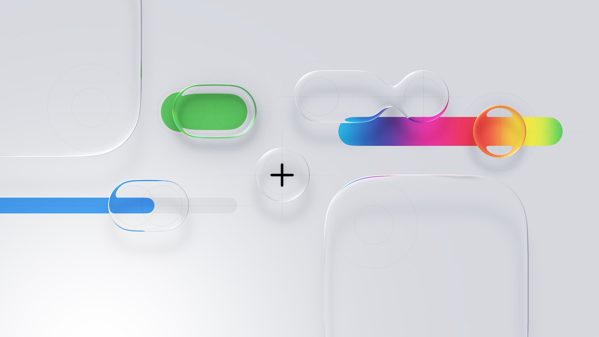
So, what makes Liquid Glass different? For years, digital design has been dominated by the "flat" aesthetic—clean lines, solid colors, and minimal depth. While efficient, this style can sometimes feel sterile. Liquid Glass is the evolution of this, reintroducing depth and texture in a sophisticated, modern way. Think of it as a blend of realism and digital minimalism.
The core principles of Liquid Glass seem to revolve around several key ideas:
- Translucency and Blur: Elements on the screen, like menus and pop-up windows, will often have a frosted glass effect. They allow the background to peek through in a beautifully blurred way, creating a sense of depth and context. This helps you understand where you are within an app, as different layers become visually distinct.
- Fluidity and Motion: Animations are expected to be smoother and more physics-based. Tapping a button might create a subtle ripple effect, like a drop of water on a calm surface. Swiping through menus could feel more like gliding through layers of a liquid. This focus on motion makes the interface feel alive and responsive.
- Glossy and Tactile Elements: Buttons, sliders, and other interactive controls are no longer just flat shapes. With Liquid Glass, they have a subtle gloss, a three-dimensional quality that makes them look more tangible and inviting to touch. The design aims to make you feel like you're interacting with a physical object, enhancing the overall experience.
- Contextual Interfaces: The new design philosophy emphasizes showing you only what you need, when you need it. This leads to cleaner screens where information and controls appear and disappear gracefully, reducing clutter and helping you focus on the task at hand.
The showcase on Apple's developer site provides a fantastic glimpse into this new world. It features direct comparisons, showing how various apps looked in iOS 18 versus how they are being reimagined for iOS 26. This before-and-after perspective makes the impact of Liquid Glass incredibly clear, highlighting the shift from a flatter, more rigid design to one that is dynamic, layered, and deeply immersive. The gallery covers apps across the entire Apple ecosystem, with examples for the iPhone, iPad, Apple Watch, and Mac, demonstrating the versatility of this new design language.
Key Changes to Expect in Your Favorite Apps
Apple's examples point to several specific trends that we can expect to see across many of the apps we use daily. These changes are designed to improve both the look and the functionality of the user interface.
A Shift Away from Bottom Navigation Bars
One of the most noticeable changes is the move away from the traditional, static navigation bars that have long occupied the bottom of our screens. For years, these bars have been the standard way to switch between an app's main sections. However, they take up valuable screen real estate that could be used for content.
In the Liquid Glass era, developers are being encouraged to explore more elegant solutions. This might include smaller, floating navigation "pills" that can be moved or hidden, contextual menus that appear only when needed, or a greater reliance on intuitive gestures for navigation. By freeing up the bottom edge of the screen, apps can offer a more expansive and uninterrupted view of your photos, messages, or documents.
Reimagined Buttons and Sliders
The humble button is getting a major makeover. Instead of being a simple colored rectangle, buttons in Liquid Glass have depth, a subtle sheen, and react to your touch with fluid animations. Sliders, used for things like adjusting volume or brightness, will also feel more responsive and physical. Imagine a slider that glows softly as you drag it or provides a gentle haptic buzz to signal its beginning and end points. These small details add up to create a more satisfying and premium-feeling experience, making mundane interactions feel more delightful.
The Rise of Elegant Popovers
"Popovers" are the small windows or panels that appear over the main app screen to provide extra information or options—think of a sharing menu or a calendar event detail view. With Liquid Glass, these popovers are becoming more sophisticated. They will often feature the signature frosted-glass background, which visually separates them from the content underneath while still maintaining a connection to it. This layering effect makes the interface easier to navigate and understand, as it clearly establishes a hierarchy of information on the screen.
Spotlight on Apps Embracing Liquid Glass
To bring these concepts to life, Apple's gallery features a diverse lineup of popular apps that are early adopters of the Liquid Glass design. The list includes big names and indie favorites alike, showing the broad appeal and flexibility of the new aesthetic.
The featured apps include Crumbl, Tide Guide, GrowPal, Lumy, Sky Guide, Linearity Curve Graphic Design, LTK, American Airlines, Lowe's, Photoroom, OmniFocus 4, CNN, Essayist, and Lucid Motors.
Let's consider how this new design might transform a few of them:
- American Airlines: For a travel app, clarity and ease of use are paramount. Liquid Glass could make the booking process feel smoother and less cluttered. Imagine translucent popovers displaying flight details without completely obscuring your search results, and glossy, inviting buttons that guide you effortlessly from selecting a seat to completing your payment.
- Lowe's: In a home improvement app, visualizing products is key. The new design could use layered interfaces to let users browse for a new appliance while easily pulling up specifications or reviews in a popover that feels like a clean pane of glass laid over the product image.
- Photoroom or Linearity Curve Graphic Design: For creative applications, the interface should empower the user, not get in their way. Liquid Glass's focus on minimalism and contextual controls means that tools and menus could fade into the background when not in use, giving the user's canvas the full spotlight. The tools themselves could have a sleek, glassy finish that makes the creative process feel more polished.
- OmniFocus 4: Productivity apps thrive on organization and focus. The layered, translucent nature of Liquid Glass could help users better visualize their projects and tasks. For example, a project's sub-tasks could appear in a semi-transparent layer above the main project list, providing detail without losing context.
Why This New Design is a Big Deal for You
While design language might sound like a topic for developers and designers, its effects are felt by every single person who uses a device. The shift to Liquid Glass is more than just a cosmetic update; it's about improving your daily interactions with technology. A cleaner interface means less visual noise and fewer distractions, helping you focus on your content. More intuitive controls and fluid animations make an app easier to learn and more pleasant to use. Ultimately, a more beautiful and responsive aesthetic can make the time you spend on your iPhone or iPad more enjoyable.
See the Future for Yourself
Reading about design is one thing, but seeing it in action is another. The comparisons and examples Apple has curated are truly the best way to understand the impact of Liquid Glass. If you're curious about how the apps you use every day are about to change for the better, the gallery is well worth a visit.
The design comparisons are best viewed on Apple's site, and they provide a compelling preview of the next generation of app design. It’s a fascinating look at the thoughtful process behind creating experiences that are not only functional but also beautiful and emotionally resonant.
This article, "Apple Shares Liquid Glass Design Gallery" first appeared on MacRumors.com
Discuss this article in our forums
from MacRumors
-via DynaSage
